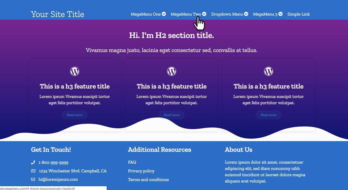
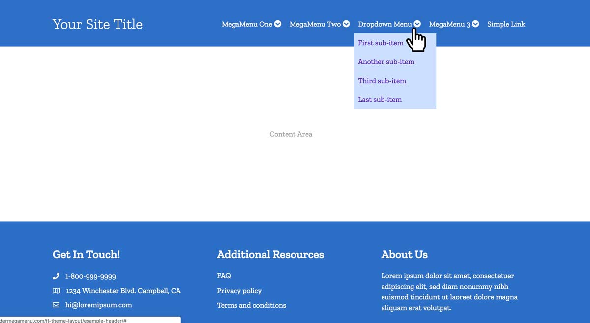
Mega Menu Demo
At long last, an easy mega menu plugin
made for Beaver Builder's Beaver Themer!
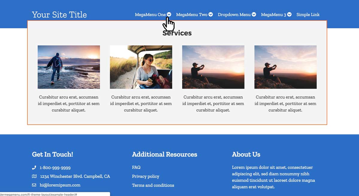
Turns ANY saved row into a Mega Menu in seconds!
Up until now, there has been no easy way to harness the building power of Beaver Builder to create mega menus. The best you could do was use a third party mega menu plugin which usually have very steep learning curves, have limited styling options, and may not work with Beaver Themer.
This is the first mega menu plugin specifically made to work with Beaver Themer.
Beaver Builder Mega Menu Features:
Instructions & Screenshots
Prefer a video to walk you through these steps?
The fine folks at Beaver Builder made this handy video to walk you through the entire process! You can watch the video embedded on this page or on their youtube channel here
2a) Create your Mobile Menu
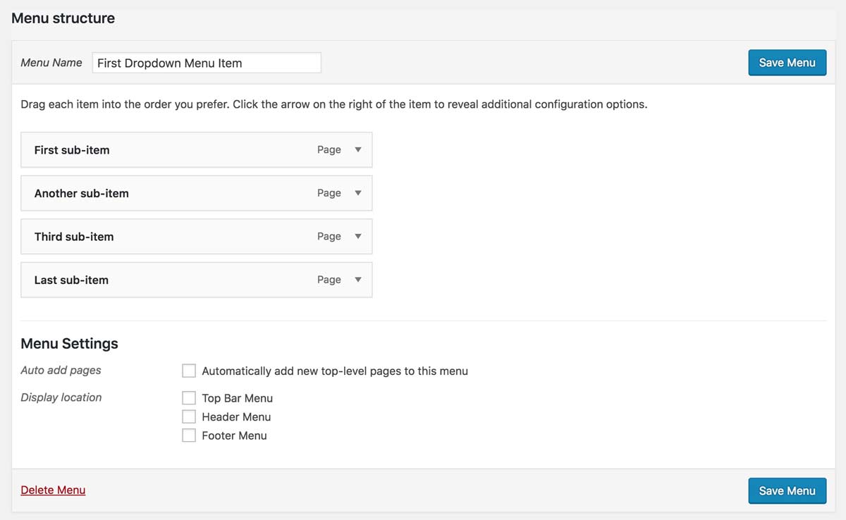
Go to Appearance > Menus and create a separate nav menu which will serve as your mobile menu. The wp nav menu used for the mobile menu should contain every page of the site / every link you want to include in your mobile menu.
2b) Optional: Create a separate nav menu for each dropdown menu item
You might want your nav menu to contain traditional dropdowns as well as mega menus. If this is you, then while you are here at Appearance > Menus, you should also create a separate nav menu for each dropdown menu item.
For example, if you wanted to have a dropdown for "about us" which only had a couple of sub-items, then a mega menu might be overkill. So you can use a dropdown for this. In the WP admin, you would create a wp nav menu which contains just the sub-pages of the About us page. If you also wanted a dropdown for, say, "jobs & internships" then that would be another separate wp nav menu.
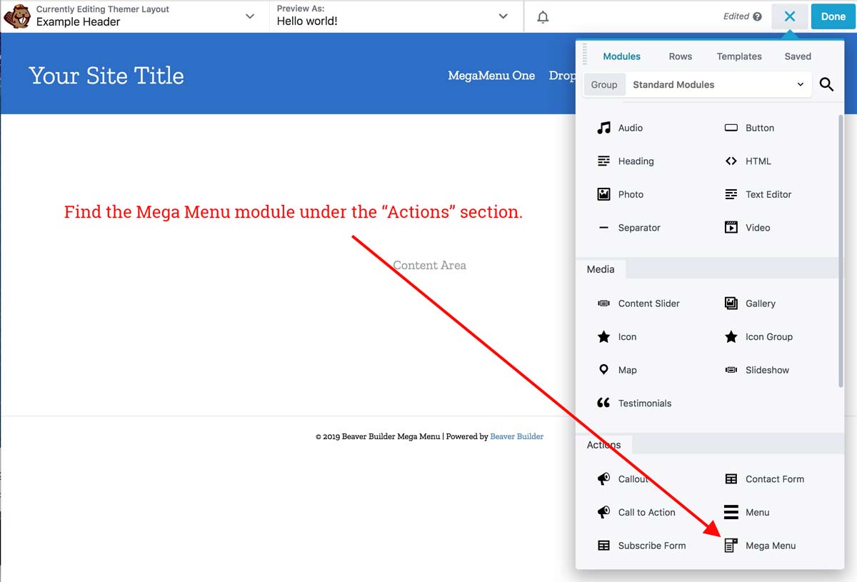
3) Add the Mega Menu to your Beaver Themer layout
(ideally this should be your Beaver Themer Header, unless you wanted to place a mega menu somewhere else)
In the Standard Modules, under the "Action" sub-section, you will see a new module called Mega Menu.
Drag the module into your header.
4) Add some items to your mega menu.
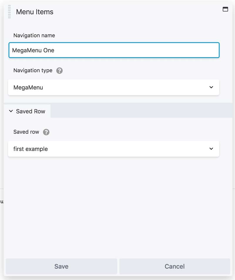
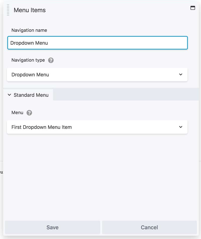
Add your menu items in the General tab. Each menu item can be either a mega menu, a dropdown menu, or a simple link.
Create each one and select the content that should be displayed.
Mega Menus: Choose one of your saved rows from the dropdown.
Dropdown: Choose your navigation menu
Simple Link: Just enter the link text and the URL.
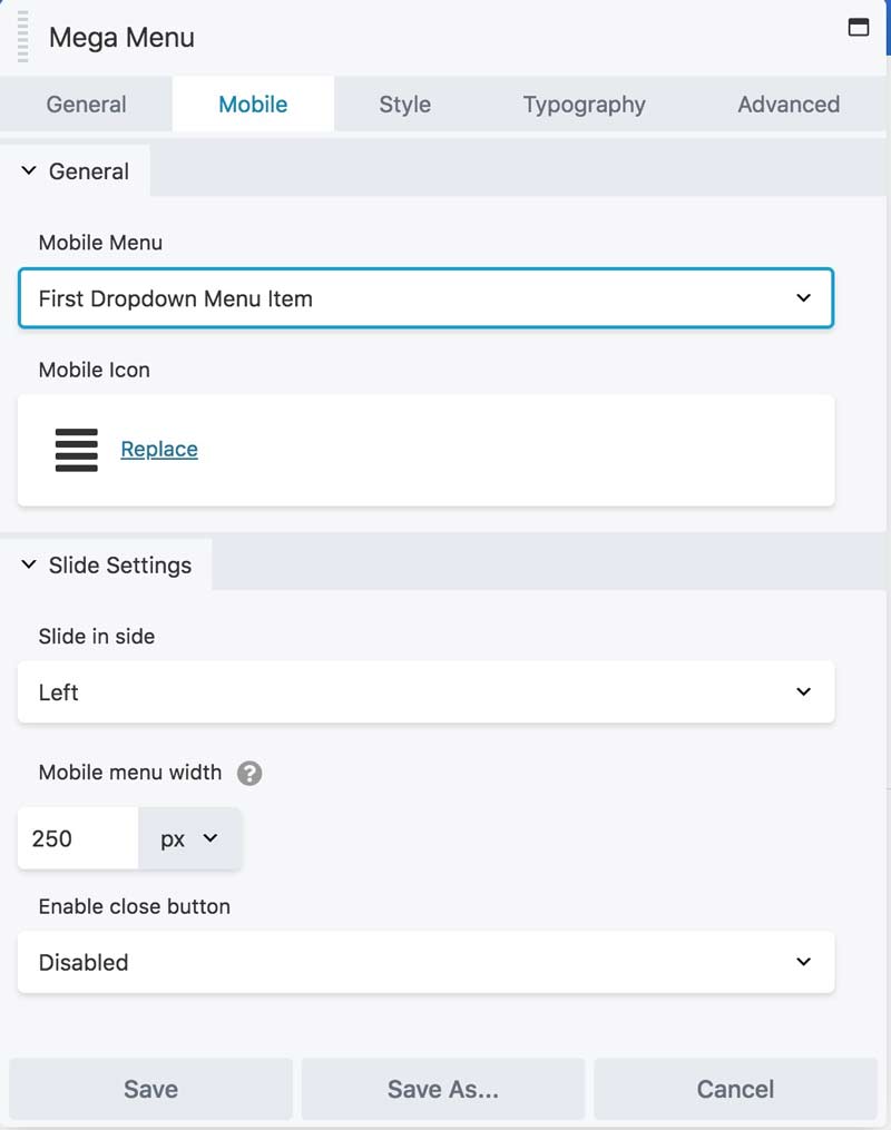
5) Choose your mobile menu
Small devices will not see the mega menu since it would be clunky and overwhelming. Instead, mobile users will see a lovely off-canvas slide in menu. Choose which menu (from step 2) to use here.
You can choose the icon, which side to slide in from, how much of the screen the overlay should take up, and define a close button.
TIP: If you want to control whether the mega menu appears on tablets (or if it should use the mobile menu) go to BB's Global Settings and change the breakpoint. Setting the breakpoint to 767px will allow the mega menu to show on tablets, whereas the default setting of 768px will use the mobile menu. This is a global setting which will affect all layouts.
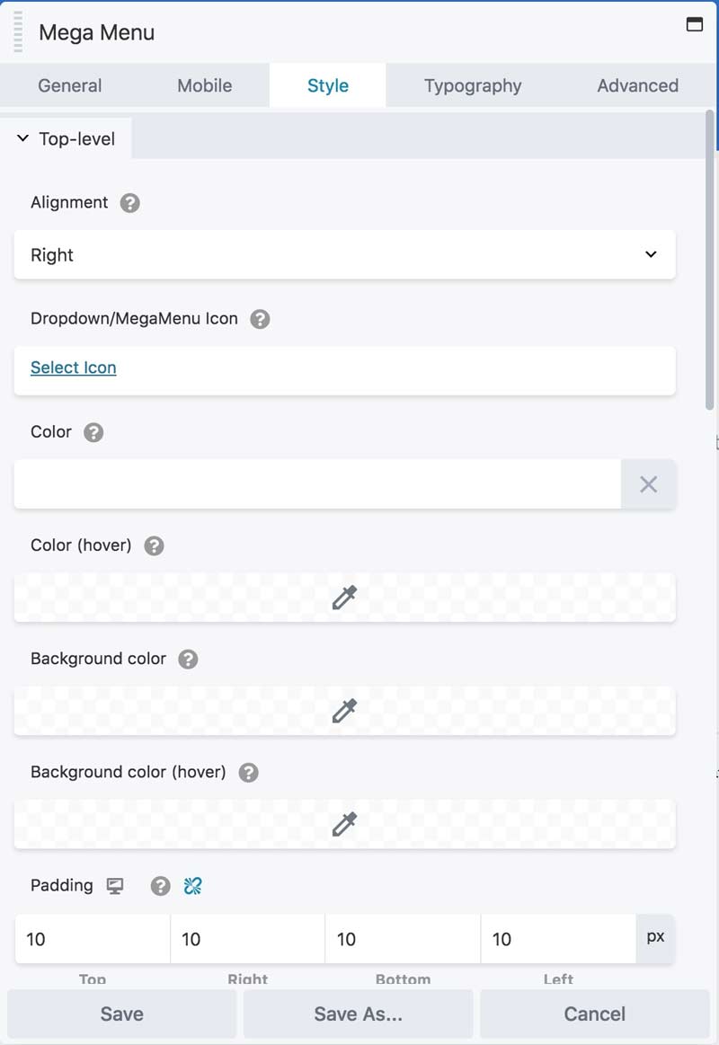
6) Style your menu
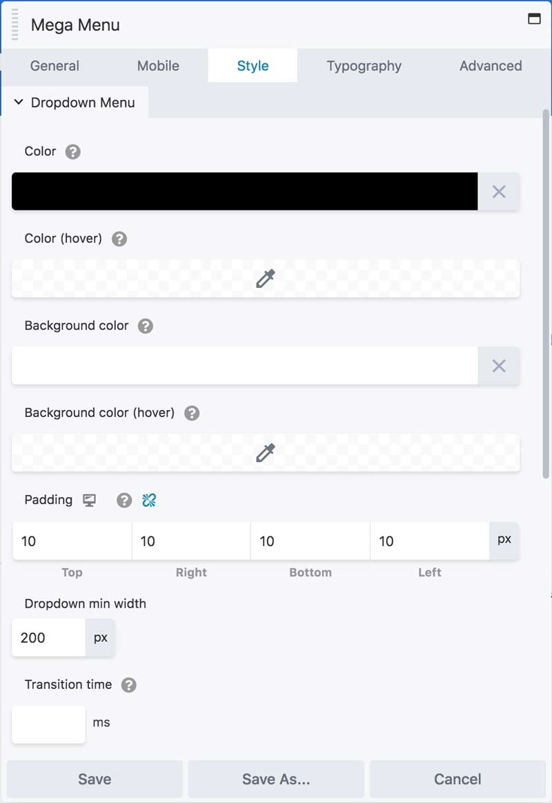
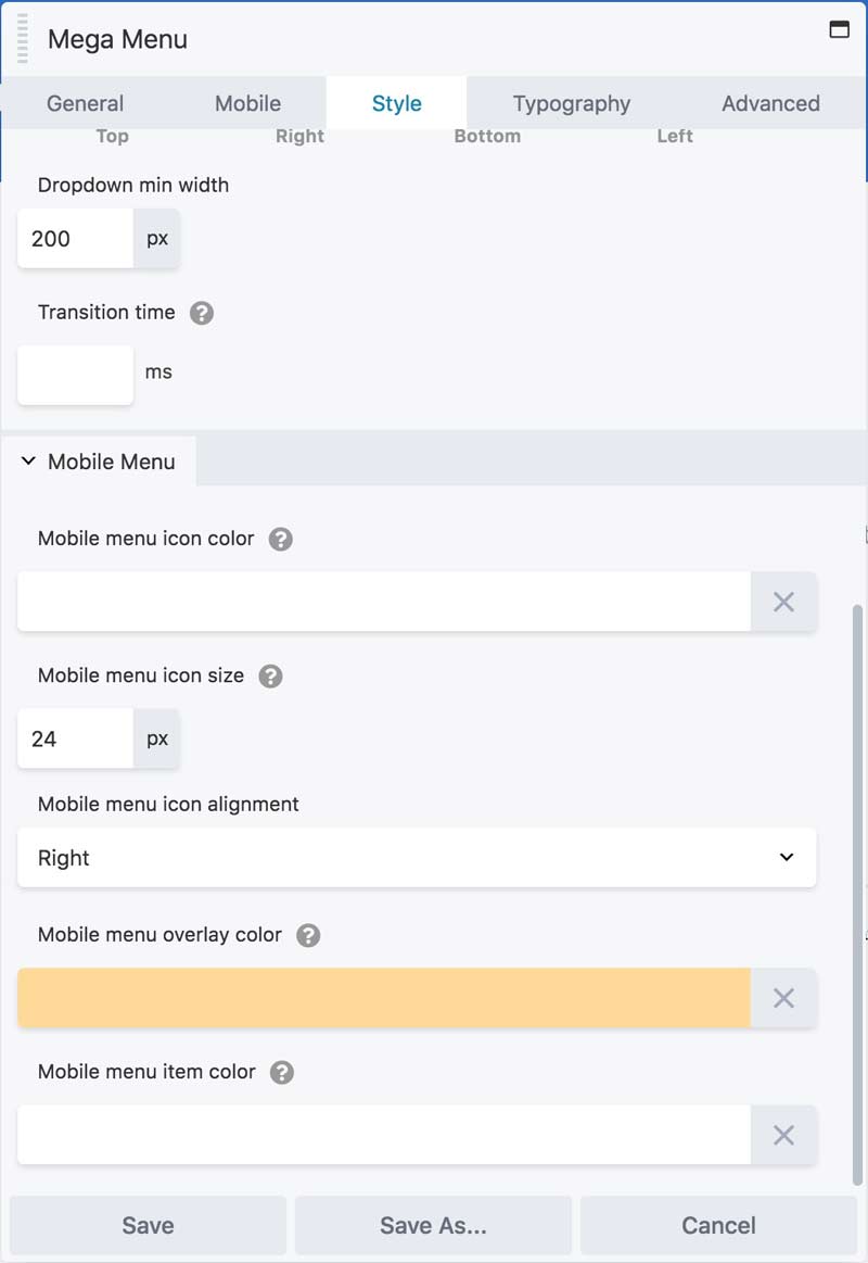
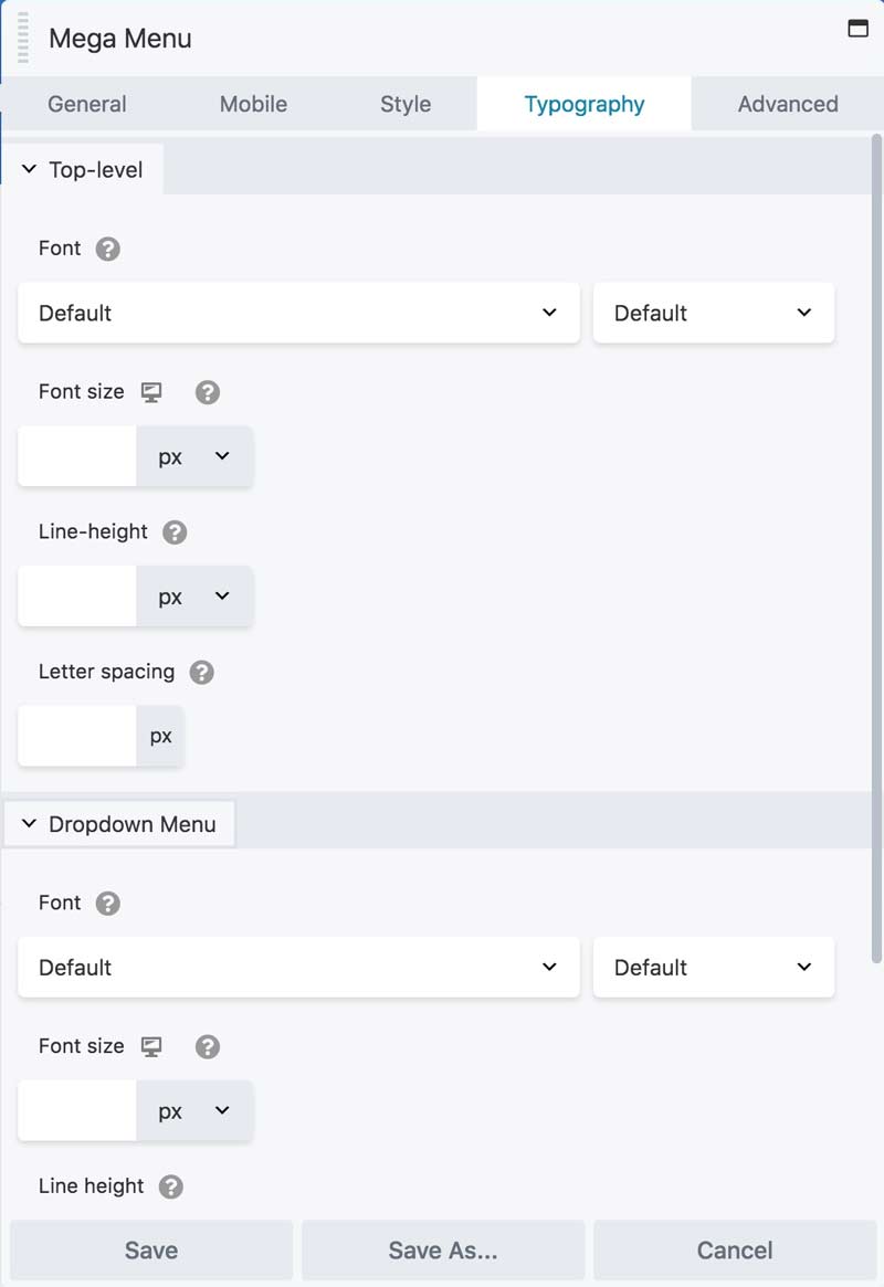
The Style tab has three sub-sections: top-level, dropdown menu, and Mobile Menu.
You can configure your color, padding, alignment and other styling specifics for each type of item independently.
You can also set your Typography for each type of item independently.
Publish, View and Tweak
Note that the mobile menu won't be visible in the Beaver editor without publishing and viewing it at small size, so you will probably want to view and tweak it a couple times to get it just the way you like it.
Three licenses, for all kinds of users:
Site Owners
$20
Per year
Developers
$50
Per year
VIP
$270
Lifetime License
